
Yield trend
The yield chart plots every completed batch of one formula: the dot is what the batch actually returned, the dashed line is what the current version expects. A table under the chart carries the same figures, batch by batch, so the shape is checkable.
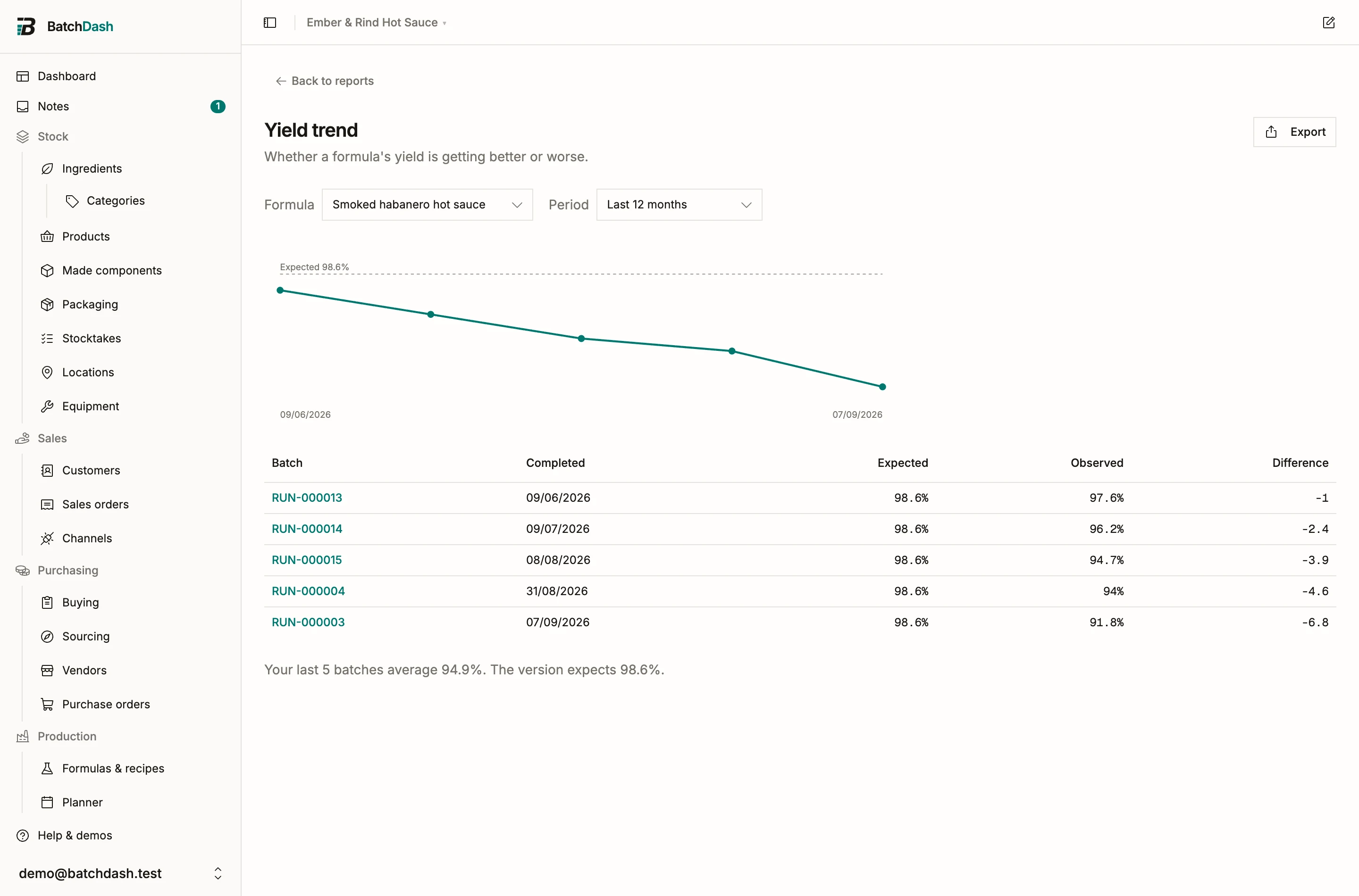
Each batch is compared against what was expected when it was planned, so updating the version later never rewrites old dots. The dashed line is today’s expectation. When your recent batches average two points or more away from it, a line under the chart says so, with both figures.
That gap is worth acting on. A version that expects 98% while your kitchen returns 94% plans every batch short, and the costs it quotes are the costs of a batch you did not make. Updating the version, or promoting a good run’s numbers into a new one, puts the plan back on what actually happens.
A batch with no recorded yield is not on the chart. Record the observed output when you complete a run and the trend builds itself.
Picking the formula
Section titled “Picking the formula”The report opens on the formula you have run most, and the picker lists the rest with their batch counts. Test batches count: a trial is a real measurement of the recipe, and leaving them out would hide exactly the runs where drift shows up first.